
Work
About
Contact
Case Study
Mynd
As a Design Studio, Mynd aims to represent itself as creative and realiable. I aimed for a clean and organised look, at the same time fresh and not too corporate.
A simple and minimalistic approach that would be appealing to any type of client.
Visual design, digital rebranding, animations.
THE CHALLENGE
-
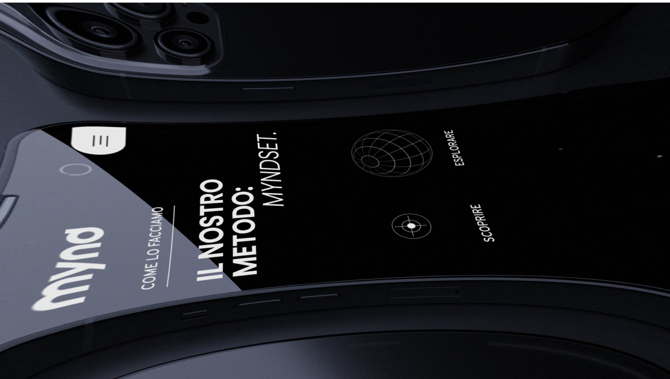
The previous website no longer reflected the Agency’s identity.It felt outdated, both in design and content, and was still aligned with the old logo and branding. With the recent rebranding, the Agency needed a fresh, modern digital presence that would better represent its evolution and communicate its values more effectively.
MY ROLE
-
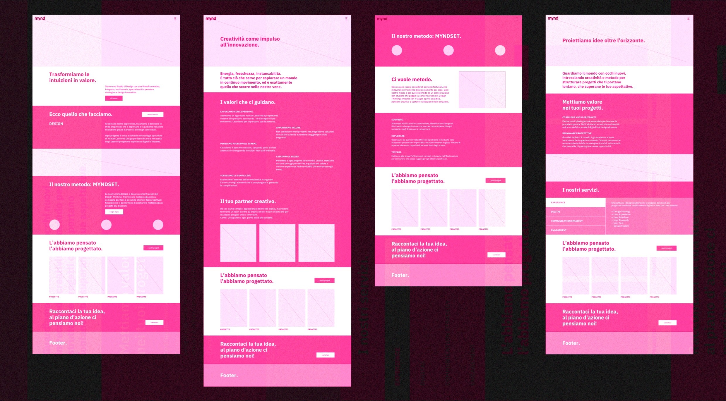
As the lead UI Designer, I was responsible for defining the overall visual language of the website, including typography, colour palette, iconography and layout principles, ensuring alignment with the brand’s identity and goals. I curated and edited the visual assets, such as images, videos and animations, to maintain visual consistency. In addition, I collaborated closely with the UX designer to translate wireframes into high-fidelity designs, and worked with developers to ensure the final implementation reflected the intended design.
THE PROPOSITION
-
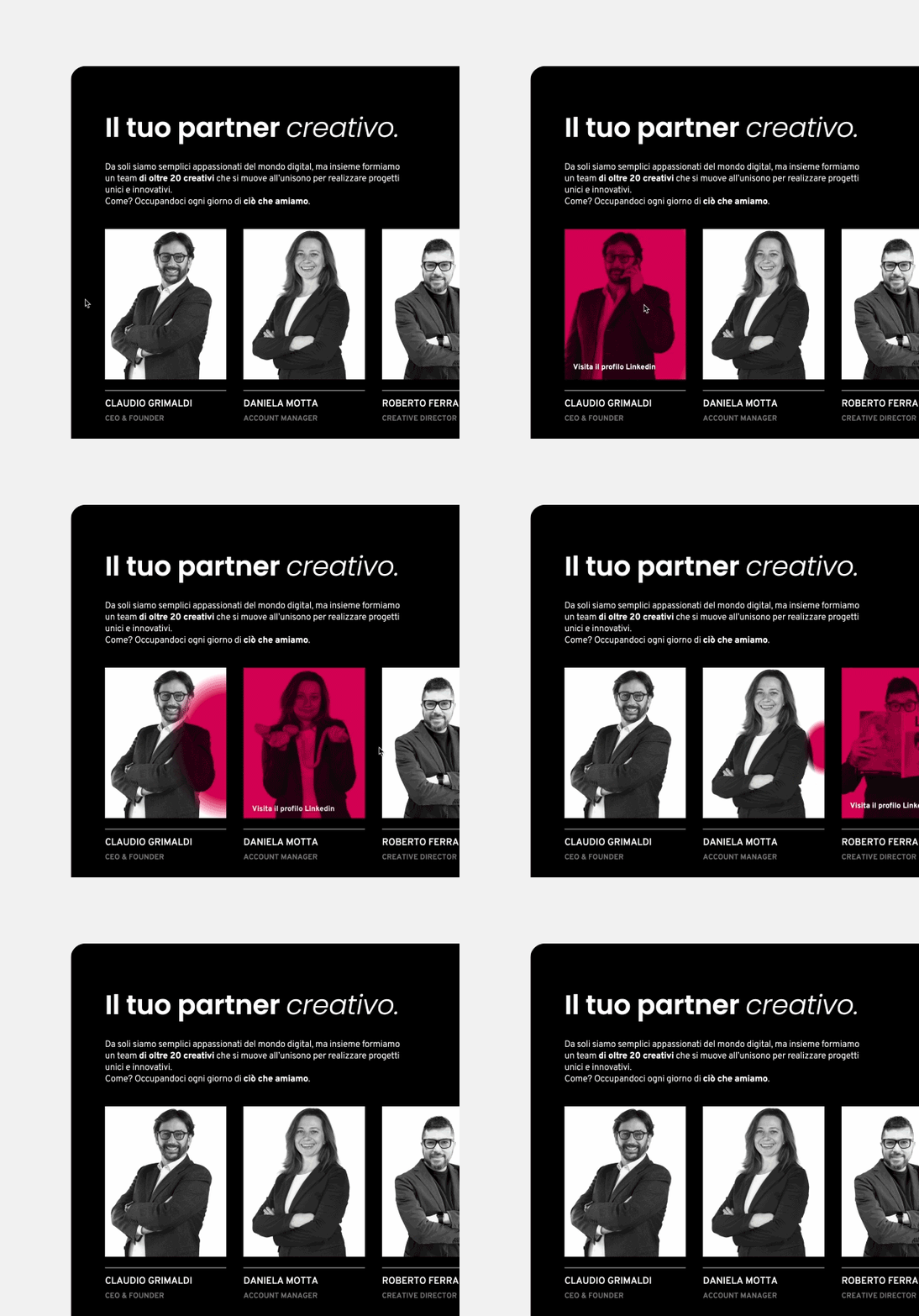
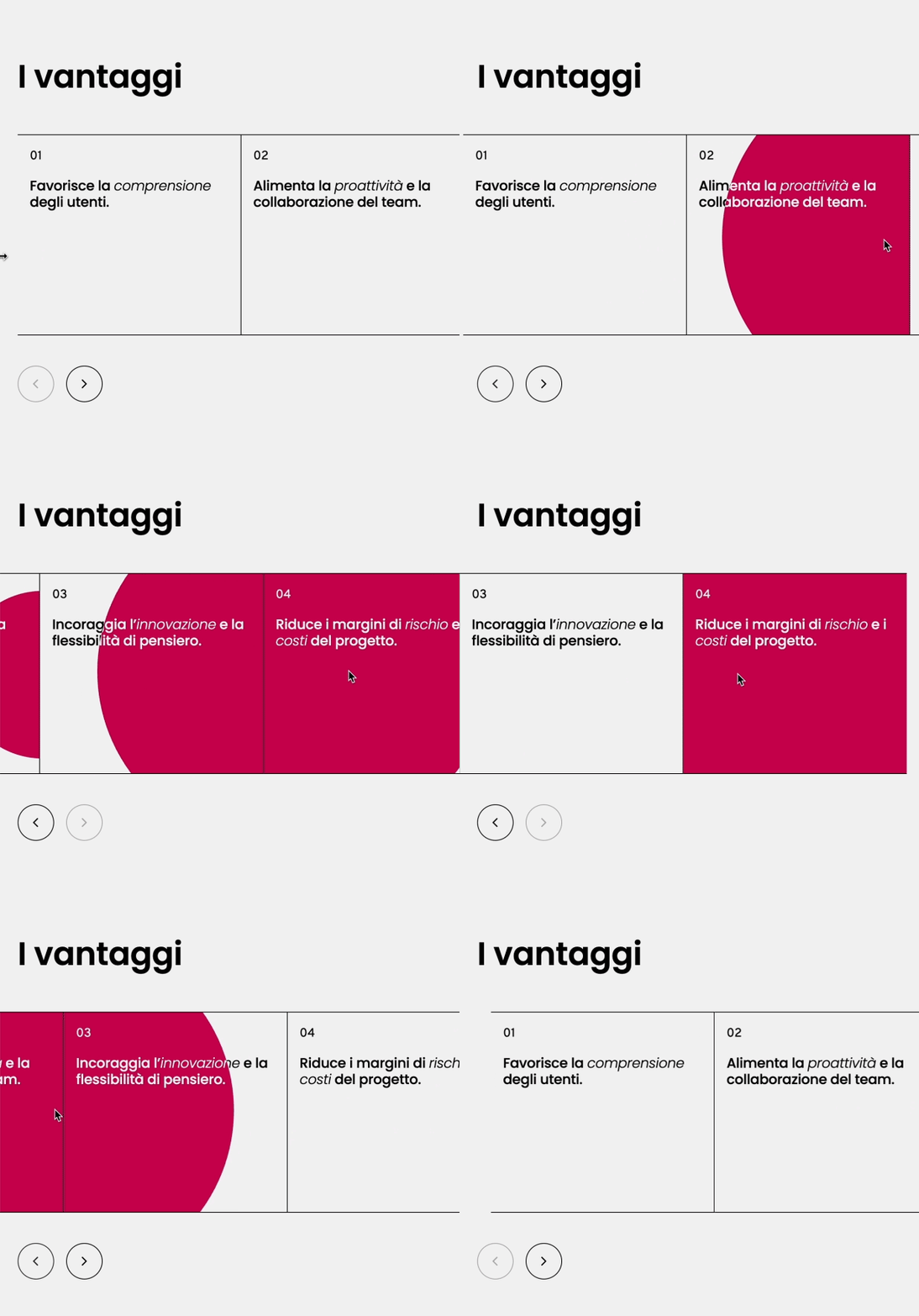
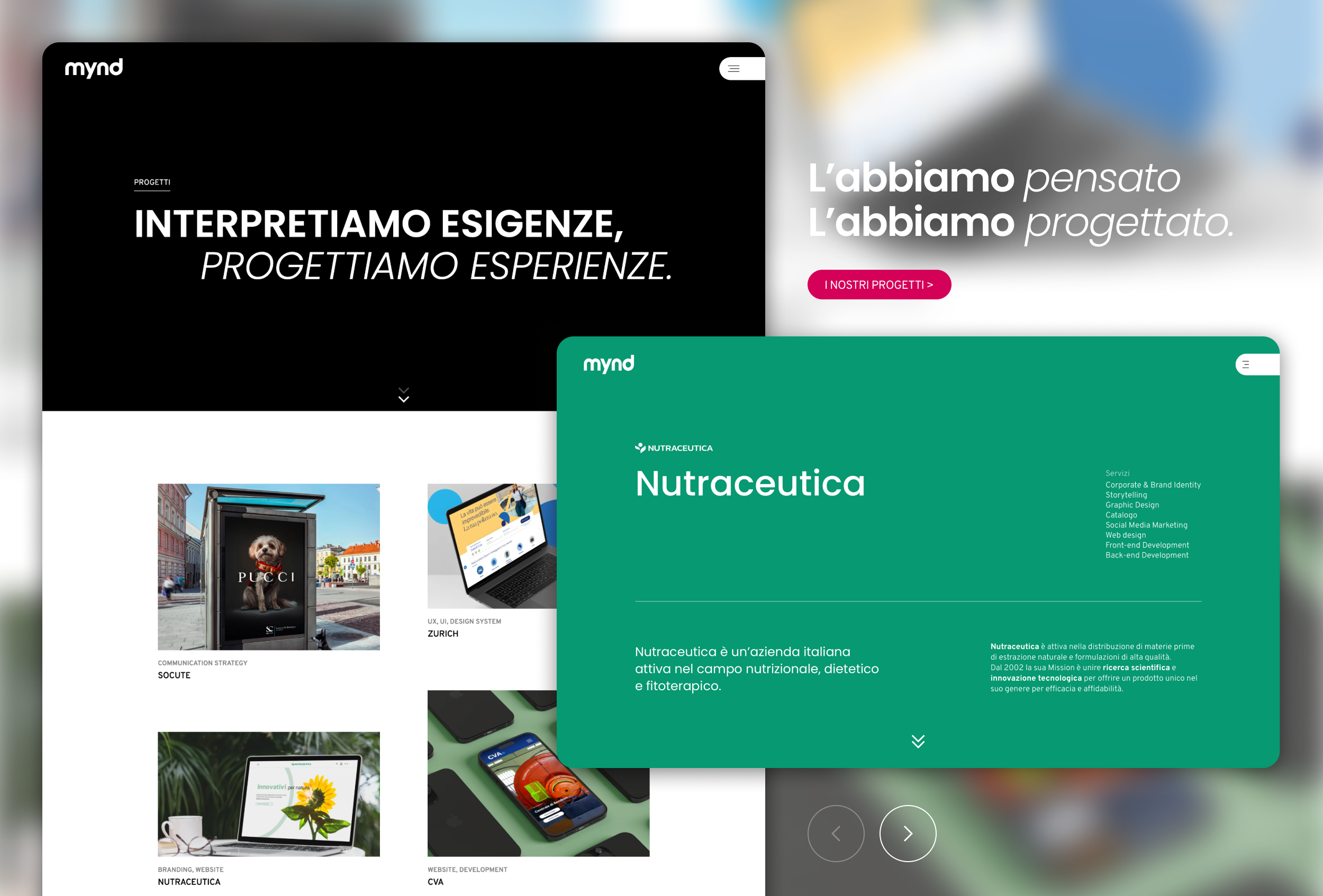
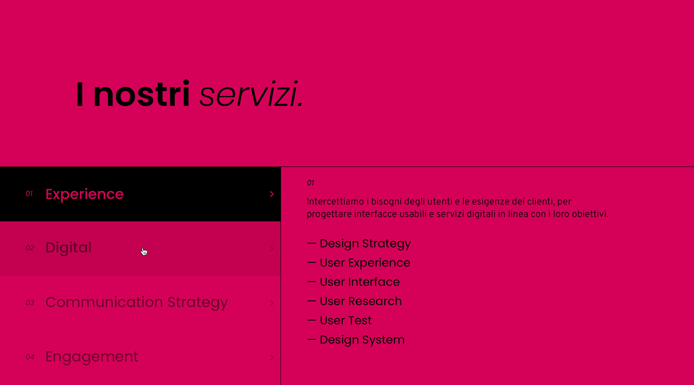
As requested, I adopted a minimalistic and clean approach for this project.
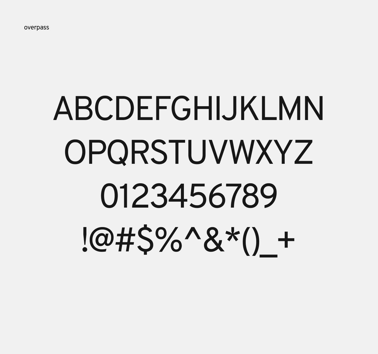
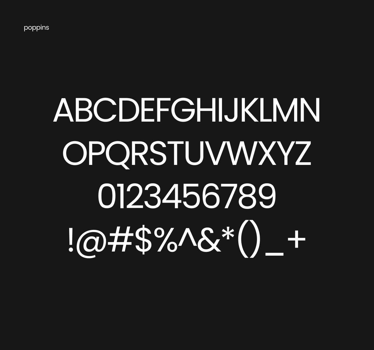
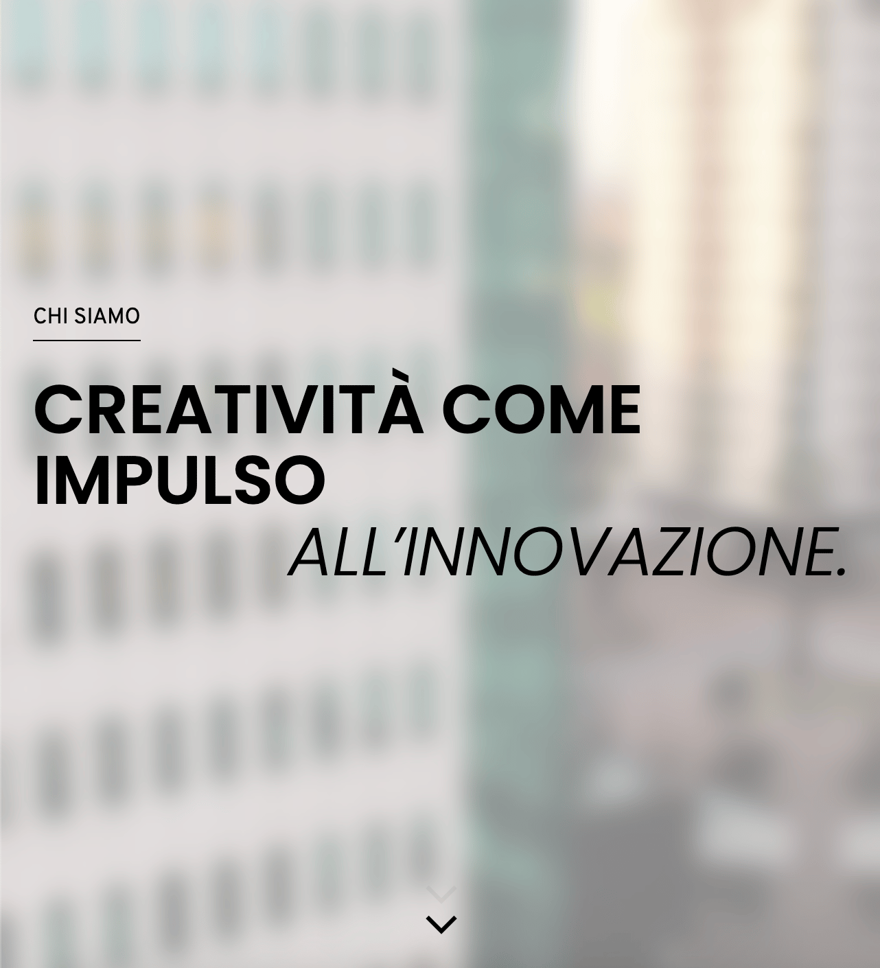
My goal was to ensure that the information on each page was easily accessible and readable, with ample space to prevent a cluttered appearance. To achieve this, I used generous yet balanced spacing between paragraphs and sections, allowing the content to breathe. Sans serif fonts were chosen to enhance readability, catering to the target audience, which often includes non-tech-savvy business owners.

VIDEOS AND ANIMATIONS
-
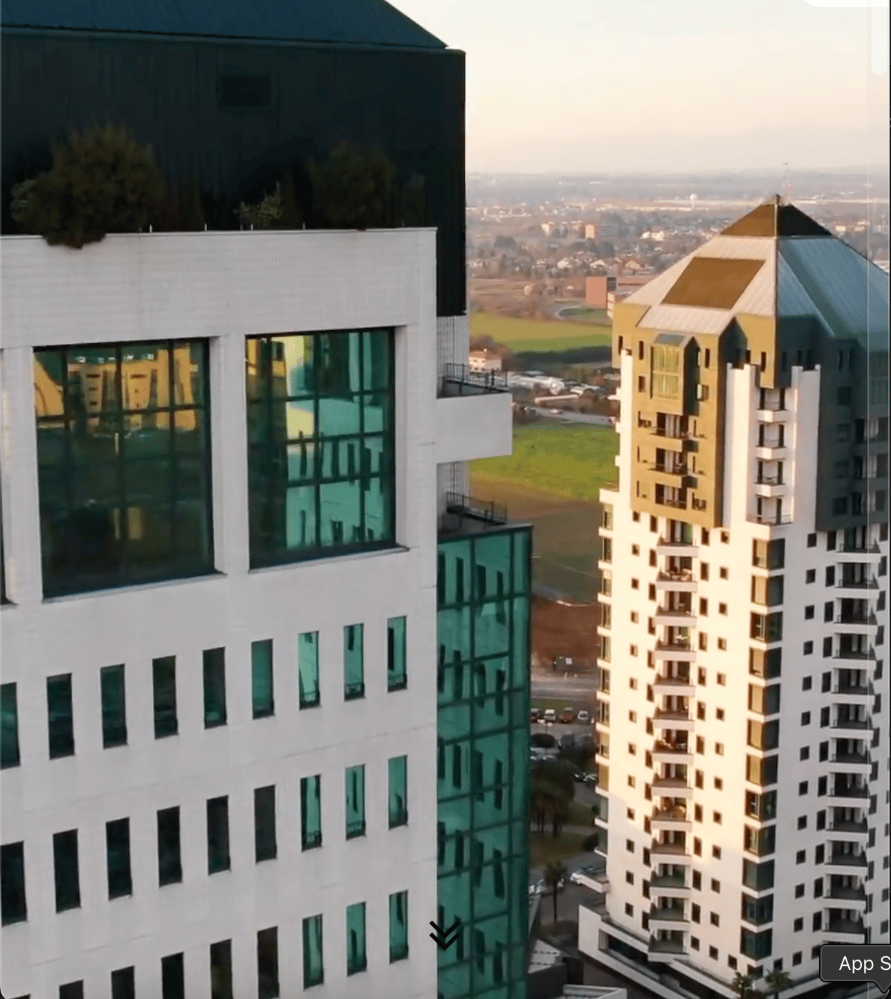
As part of the user interface design, I created a video for the homepage using After Effects.
This video serves as an introduction to the Studio's work and highlights its mission for the future.
Additionally, I made a promotional video to showcase the new website, along with animations that were integrated into the Studio’s initial social media strategy. These elements were designed to engage the audience and highlight key features of the website, helping to build awareness and drive traffic across various platforms.

Other Projects
SEE PROJECT

SEE PROJECT
SEE PROJECT

Let me give you some info about me.
ABOUT

@

CONTACT
SOCIAL
Behance


@
Case Study
Mynd
As a Design Studio, Mynd aims to represent itself as creative and realiable. I aimed for a clean and organised look, at the same time fresh and not too corporate.
A simple and minimalistic approach that would be appealing to any type of client.
Visual design, digital rebranding, animations.
THE CHALLENGE
-
The previous website no longer reflected the Agency’s identity.It felt outdated, both in design and content, and was still aligned with the old logo and branding. With the recent rebranding, the Agency needed a fresh, modern digital presence that would better represent its evolution and communicate its values more effectively.
MY ROLE
-
As the lead UI Designer, I was responsible for defining the overall visual language of the website, including typography, colour palette, iconography and layout principles, ensuring alignment with the brand’s identity and goals. I curated and edited the visual assets, such as images, videos and animations, to maintain visual consistency. In addition, I collaborated closely with the UX designer to translate wireframes into high-fidelity designs, and worked with developers to ensure the final implementation reflected the intended design.
THE PROPOSITION
-
As requested, I adopted a minimalistic and clean approach for this project.
My goal was to ensure that the information on each page was easily accessible and readable, with ample space to prevent a cluttered appearance. To achieve this, I used generous yet balanced spacing between paragraphs and sections, allowing the content to breathe. Sans serif fonts were chosen to enhance readability, catering to the target audience, which often includes non-tech-savvy business owners.
VIDEOS AND ANIMATIONS
-
As part of the user interface design, I created a video for the homepage using After Effects.
This video serves as an introduction to the Studio's work and highlights its mission for the future.
Additionally, I made a promotional video to showcase the new website, along with animations that were integrated into the Studio’s initial social media strategy. These elements were designed to engage the audience and highlight key features of the website, helping to build awareness and drive traffic across various platforms.

Other Projects
SEE PROJECT
SEE PROJECT
SEE PROJECT

Let me give you some info about me.
ABOUT

@
CONTACT
SOCIAL
Behance

@
Case Study
Mynd
As a Design Studio, Mynd aims to represent itself as creative and realiable. I aimed for a clean and organised look, at the same time fresh and not too corporate.
A simple and minimalistic approach that would be appealing to any type of client.
Visual design, digital rebranding, animations.
THE CHALLENGE
-
The previous website no longer reflected the Agency’s identity.It felt outdated, both in design and content, and was still aligned with the old logo and branding. With the recent rebranding, the Agency needed a fresh, modern digital presence that would better represent its evolution and communicate its values more effectively.
MY ROLE
-
As the lead UI Designer, I was responsible for defining the overall visual language of the website, including typography, colour palette, iconography and layout principles, ensuring alignment with the brand’s identity and goals. I curated and edited the visual assets, such as images, videos and animations, to maintain visual consistency. In addition, I collaborated closely with the UX designer to translate wireframes into high-fidelity designs, and worked with developers to ensure the final implementation reflected the intended design.
THE PROPOSITION
-
As requested, I adopted a minimalistic and clean approach for this project.
My goal was to ensure that the information on each page was easily accessible and readable, with ample space to prevent a cluttered appearance. To achieve this, I used generous yet balanced spacing between paragraphs and sections, allowing the content to breathe. Sans serif fonts were chosen to enhance readability, catering to the target audience, which often includes non-tech-savvy business owners.
VIDEOS AND ANIMATIONS
-
As part of the user interface design, I created a video for the homepage using After Effects.
This video serves as an introduction to the Studio's work and highlights its mission for the future.
Additionally, I made a promotional video to showcase the new website, along with animations that were integrated into the Studio’s initial social media strategy. These elements were designed to engage the audience and highlight key features of the website, helping to build awareness and drive traffic across various platforms.

Other Projects
SEE PROJECT
SEE PROJECT
SEE PROJECT

Let me give you some info about me.
ABOUT

@
CONTACT
lspng@proton.me
SOCIAL
Behance
