
Work
About
Contact
Case Study
Resonances
Resonances needed a living platform where science and art collide. This project was about merging a community forum and an exhibition space into one intuitive, beautifully branded experience.
Information architecture, visual design, digital rebranding.
THE CHALLENGE
-
Resonances is an art and science exhibition organised by the European Commission.
The intention behind the website was not only to provide a dedicated space for the exhibition but also to build a community where scientists and artists could engage in discussions around the annual theme and collaborate on creating new works. Currently, SciArt members interact through a forum, while the exhibition has a separate showcase website. The goal was to merge these two elements into a cohesive and visually appealing design that would attract artists, designers, and the scientific community alike.
MY ROLE
-
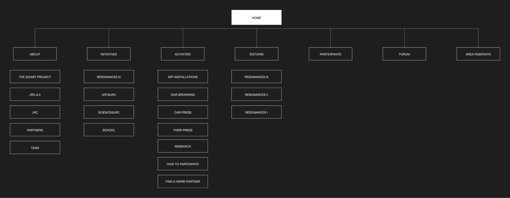
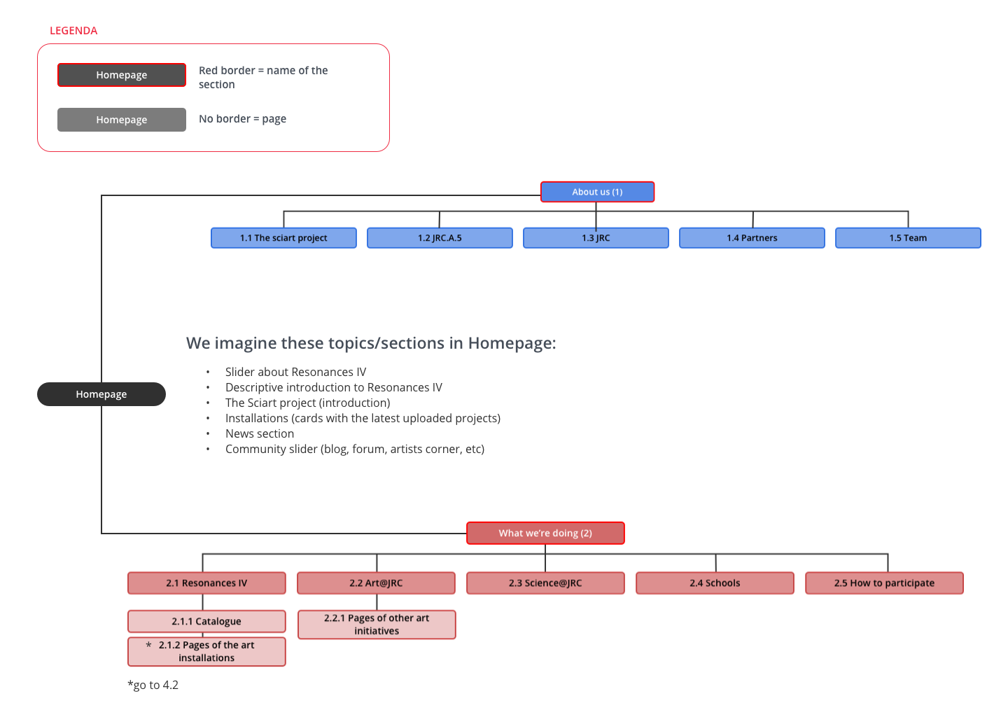
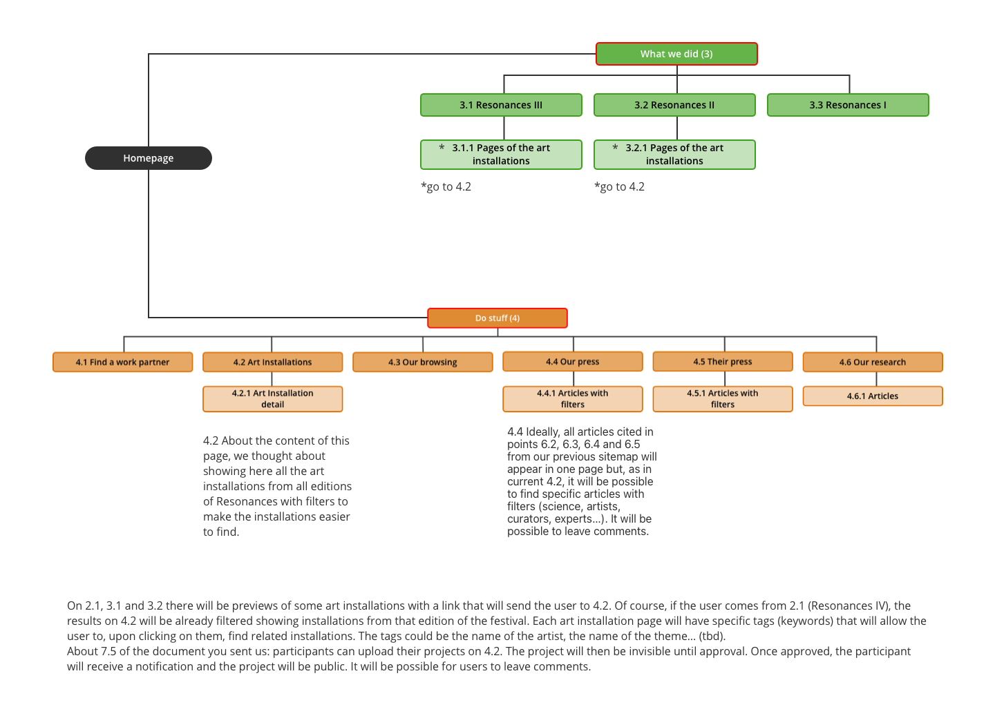
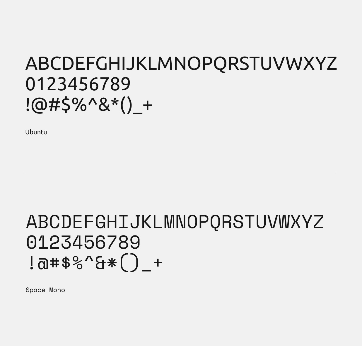
As the main designer on the project, I had a hand in both UX and UI. I defined the information architecture and sitemap, mapped user journeys with the help of a colleague, created wireframes to shape the overall experience and built interacting prototypes. On the visual side, I established the interface design in line with the client’s brand guidelines, developing a consistent visual language through typography, color, and layout.
THE PROPOSITION
-
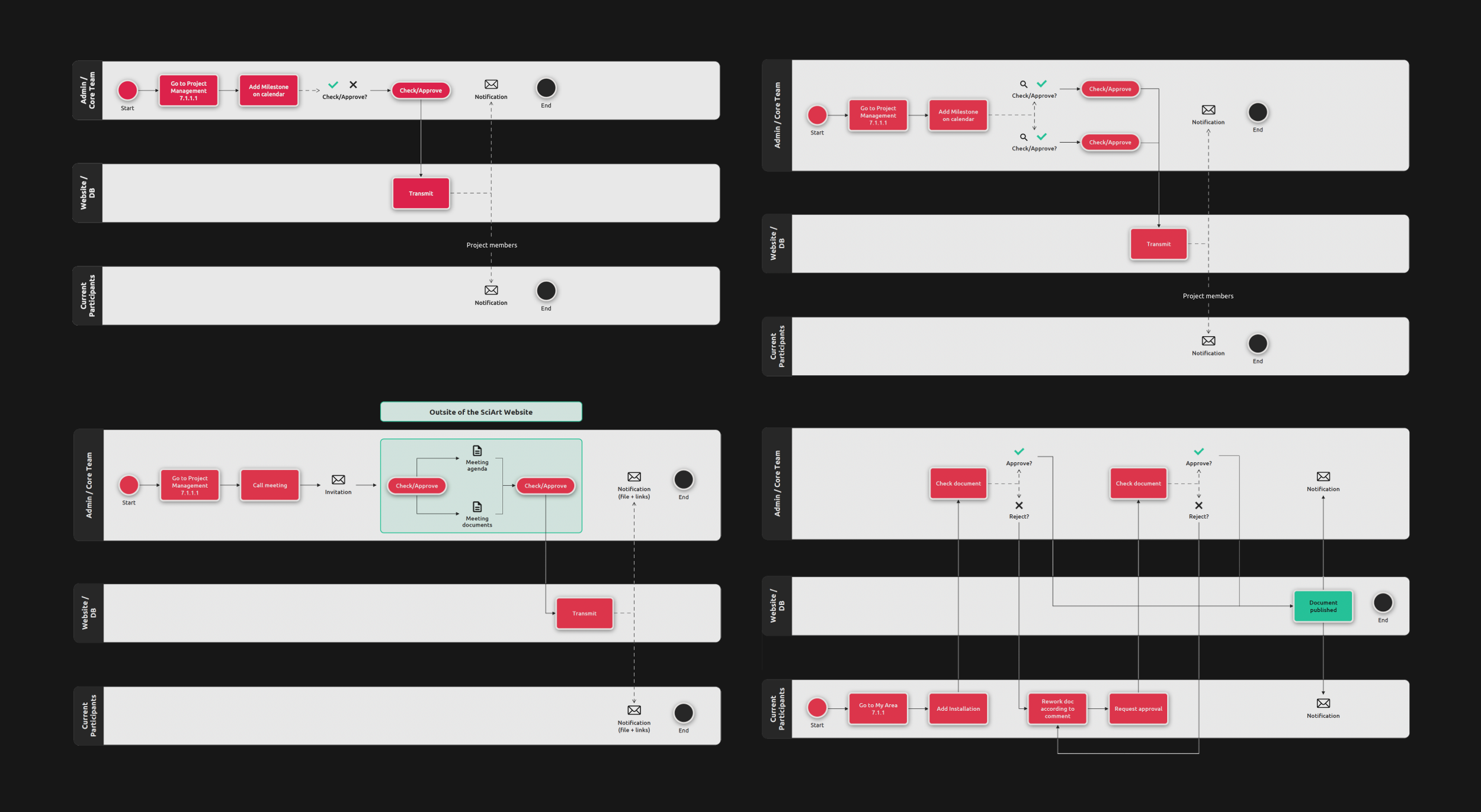
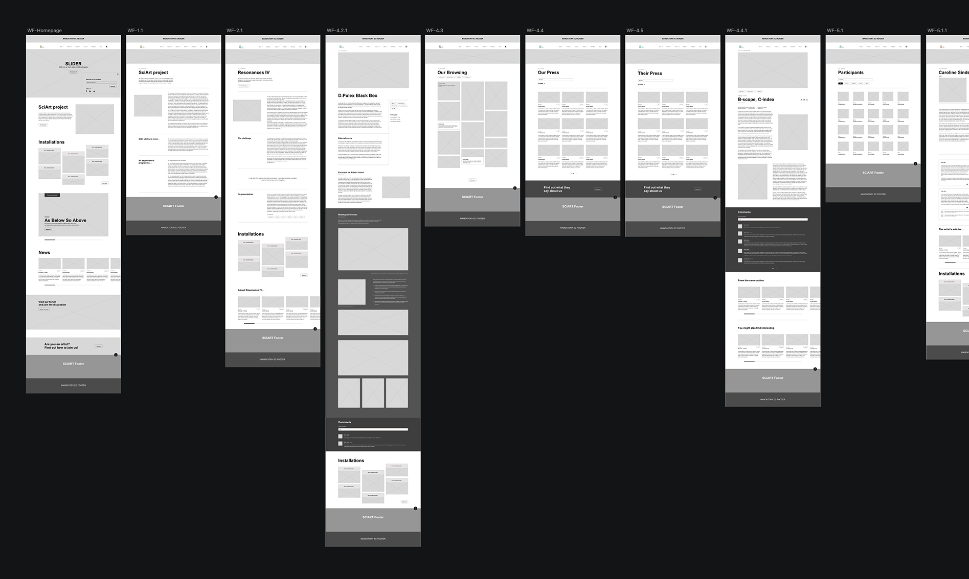
Understanding the website’s structure, purpose, and content was a key priority at the start of the project. Much of the initial phase was dedicated to mapping user journeys and building a clear site architecture. Once the sitemap was defined, I moved on to wireframing and UI design.
The final website included both a public-facing section and a private area with five levels of user access: ordinary users, Resonances participants, moderators, and admins.
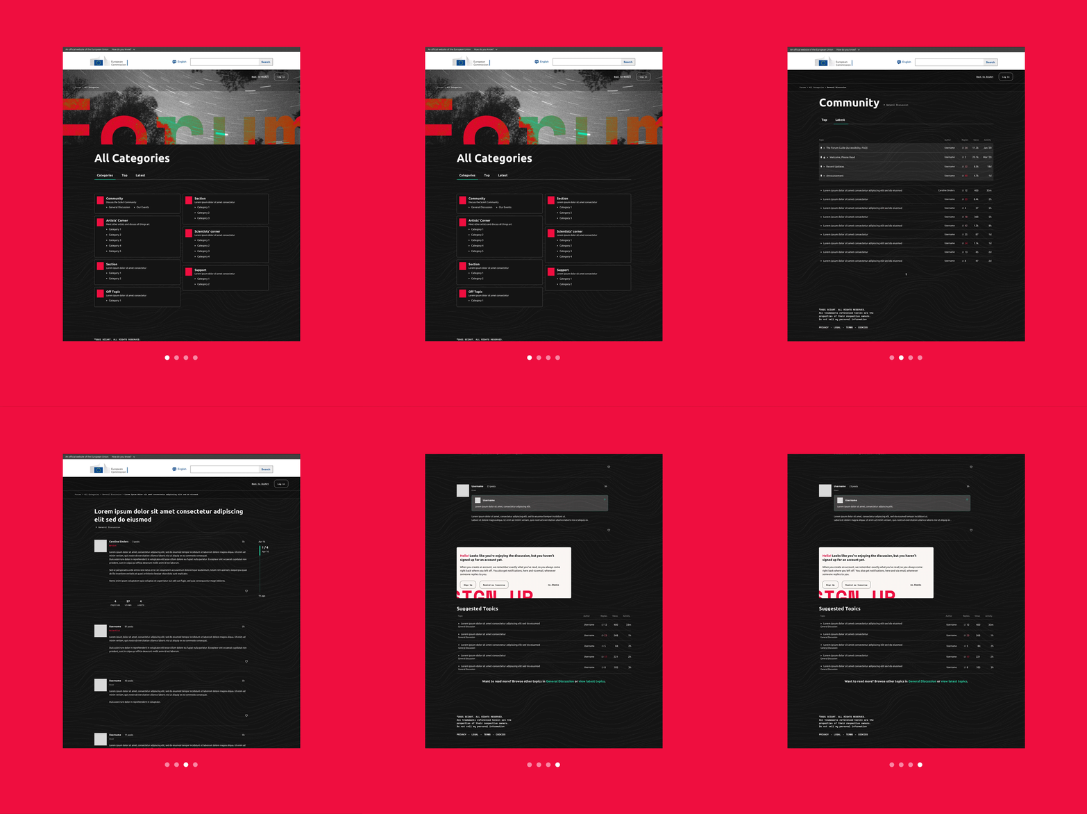
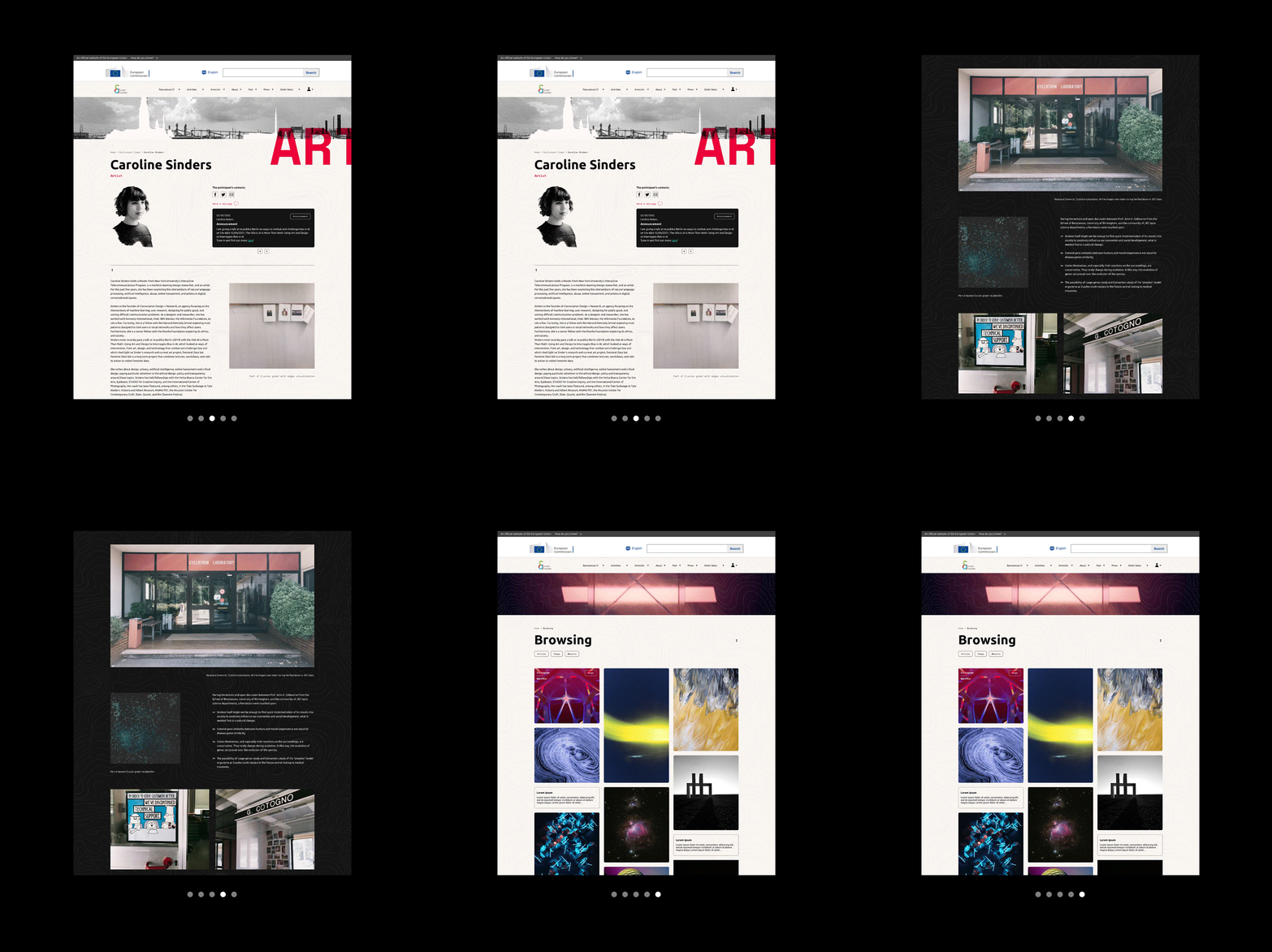
The public section introduced the organisation and exhibition concept, showcased artworks along with their creative processes, and featured detailed bio pages for participating scientists and artists. It also included in-depth articles on topics relevant to the community, many of which allowed comments to foster engagement and dialogue.
UI DESIGN
-
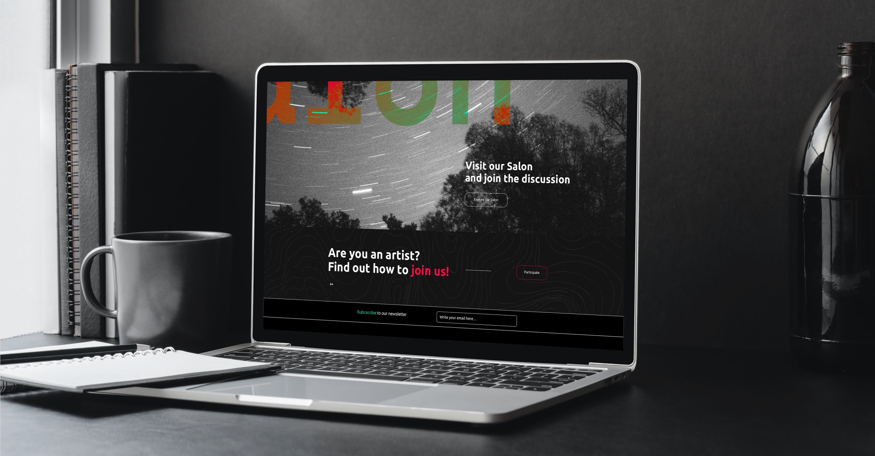
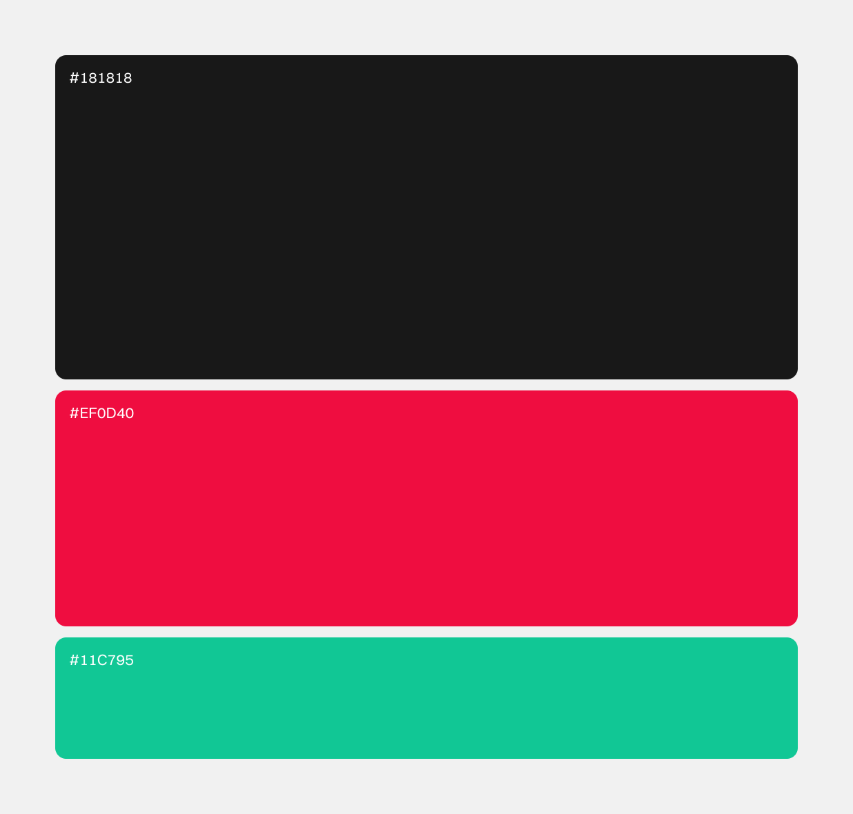
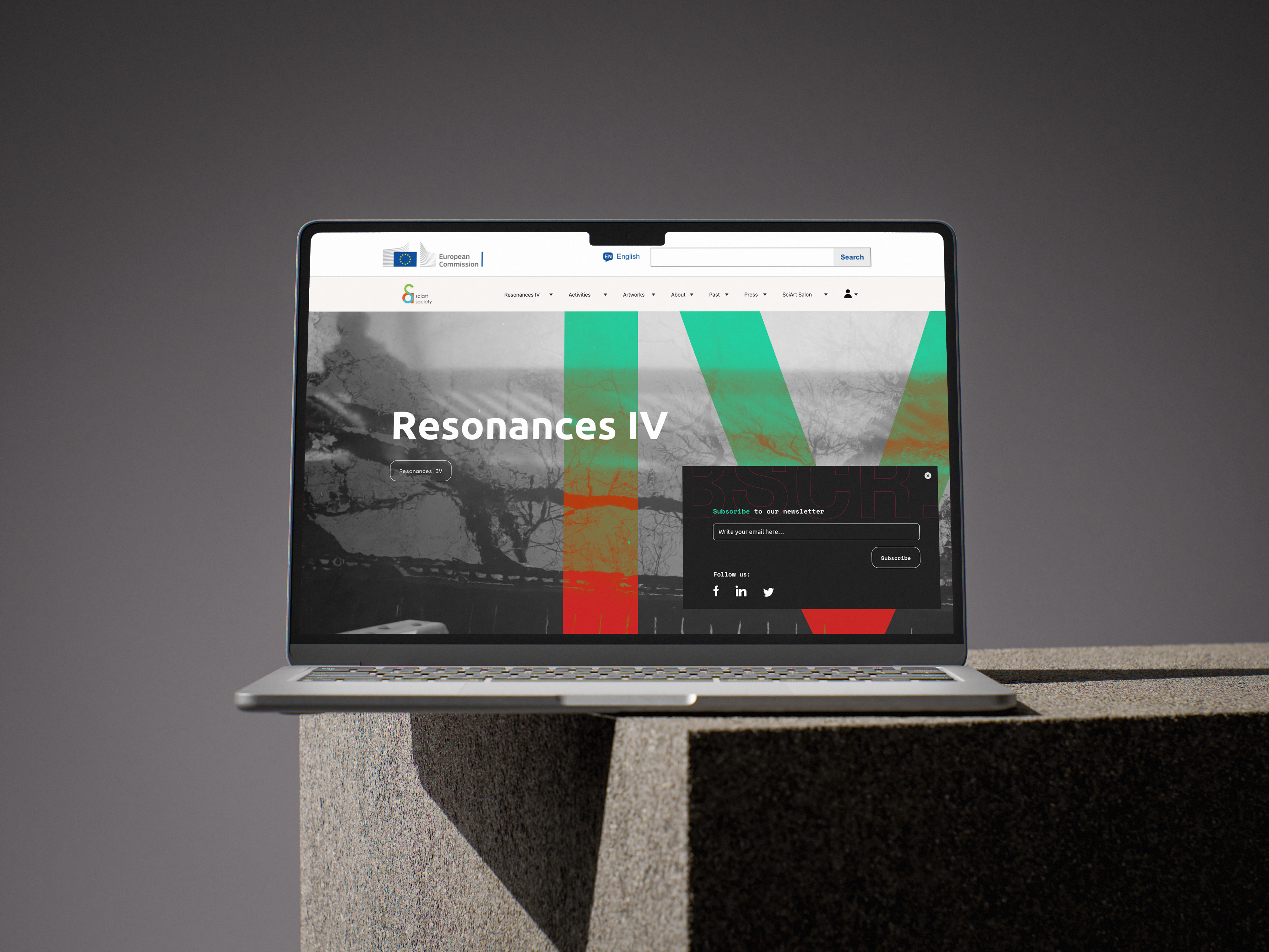
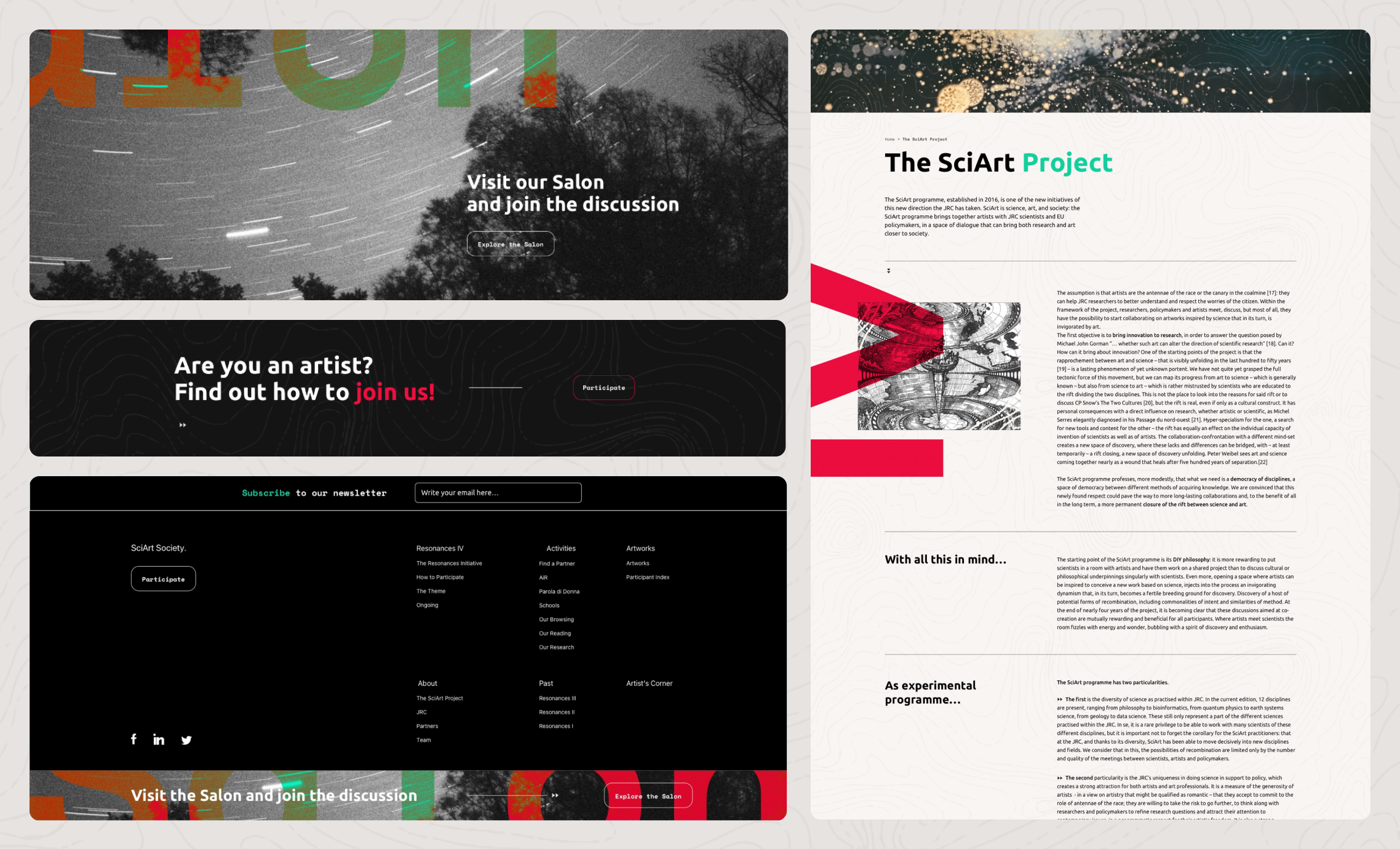
For the website’s visual direction, I opted for a minimalist black-and-white colour scheme, enhanced by subtle red and green accents. This palette provided a neutral backdrop that felt elegant and contemporary, while the accent colours were used strategically to highlight key elements and guide user attention. The images featured on the site consisted exclusively of artworks created by Resonances participants, which not only aligned with the desired aesthetic, but also offered visibility to the artists and scientists behind each piece.

THANKS FOR WATCHING
-

Other Projects
SEE PROJECT

SEE PROJECT
SEE PROJECT

Let me give you some info about me.
ABOUT

@

CONTACT
SOCIAL
Behance


@
Case Study
Resonances
Resonances needed a living platform where science and art collide. This project was about merging a community forum and an exhibition space into one intuitive, beautifully branded experience.
Information architecture, visual design, digital rebranding.
THE CHALLENGE
-
Resonances is an art and science exhibition organised by the European Commission.
The intention behind the website was not only to provide a dedicated space for the exhibition but also to build a community where scientists and artists could engage in discussions around the annual theme and collaborate on creating new works. Currently, SciArt members interact through a forum, while the exhibition has a separate showcase website. The goal was to merge these two elements into a cohesive and visually appealing design that would attract artists, designers, and the scientific community alike.
MY ROLE
-
As the main designer on the project, I had a hand in both UX and UI. I defined the information architecture and sitemap, mapped user journeys with the help of a colleague, created wireframes to shape the overall experience and built interacting prototypes. On the visual side, I established the interface design in line with the client’s brand guidelines, developing a consistent visual language through typography, color, and layout.
THE PROPOSITION
-
Understanding the website’s structure, purpose, and content was a key priority at the start of the project. Much of the initial phase was dedicated to mapping user journeys and building a clear site architecture. Once the sitemap was defined, I moved on to wireframing and UI design.
The final website included both a public-facing section and a private area with five levels of user access: ordinary users, Resonances participants, moderators, and admins.
The public section introduced the organisation and exhibition concept, showcased artworks along with their creative processes, and featured detailed bio pages for participating scientists and artists. It also included in-depth articles on topics relevant to the community, many of which allowed comments to foster engagement and dialogue.
UI DESIGN
-
For the website’s visual direction, I opted for a minimalist black-and-white colour scheme, enhanced by subtle red and green accents. This palette provided a neutral backdrop that felt elegant and contemporary, while the accent colours were used strategically to highlight key elements and guide user attention. The images featured on the site consisted exclusively of artworks created by Resonances participants, which not only aligned with the desired aesthetic, but also offered visibility to the artists and scientists behind each piece.
THANKS FOR WATCHING
-

Other Projects
SEE PROJECT
SEE PROJECT
SEE PROJECT

Let me give you some info about me.
ABOUT

@
CONTACT
SOCIAL
Behance

@
Case Study
Resonances
Resonances needed a living platform where science and art collide. This project was about merging a community forum and an exhibition space into one intuitive, beautifully branded experience.
Information architecture, visual design, digital rebranding.
THE CHALLENGE
-
Resonances is an art and science exhibition organised by the European Commission.
The intention behind the website was not only to provide a dedicated space for the exhibition but also to build a community where scientists and artists could engage in discussions around the annual theme and collaborate on creating new works. Currently, SciArt members interact through a forum, while the exhibition has a separate showcase website. The goal was to merge these two elements into a cohesive and visually appealing design that would attract artists, designers, and the scientific community alike.
MY ROLE
-
As the main designer on the project, I had a hand in both UX and UI. I defined the information architecture and sitemap, mapped user journeys with the help of a colleague, created wireframes to shape the overall experience and built interacting prototypes. On the visual side, I established the interface design in line with the client’s brand guidelines, developing a consistent visual language through typography, color, and layout.
THE PROPOSITION
-
Understanding the website’s structure, purpose, and content was a key priority at the start of the project. Much of the initial phase was dedicated to mapping user journeys and building a clear site architecture. Once the sitemap was defined, I moved on to wireframing and UI design.
The final website included both a public-facing section and a private area with five levels of user access: ordinary users, Resonances participants, moderators, and admins.
The public section introduced the organisation and exhibition concept, showcased artworks along with their creative processes, and featured detailed bio pages for participating scientists and artists. It also included in-depth articles on topics relevant to the community, many of which allowed comments to foster engagement and dialogue.
UI DESIGN
-
For the website’s visual direction, I opted for a minimalist black-and-white colour scheme, enhanced by subtle red and green accents. This palette provided a neutral backdrop that felt elegant and contemporary, while the accent colours were used strategically to highlight key elements and guide user attention. The images featured on the site consisted exclusively of artworks created by Resonances participants, which not only aligned with the desired aesthetic, but also offered visibility to the artists and scientists behind each piece.
THANKS FOR WATCHING
-

Other Projects
SEE PROJECT
SEE PROJECT
SEE PROJECT

Let me give you some info about me.
ABOUT

@
CONTACT
lspng@proton.me
SOCIAL
Behance
