
Work
About
Contact
Case Study
Improntapositiva
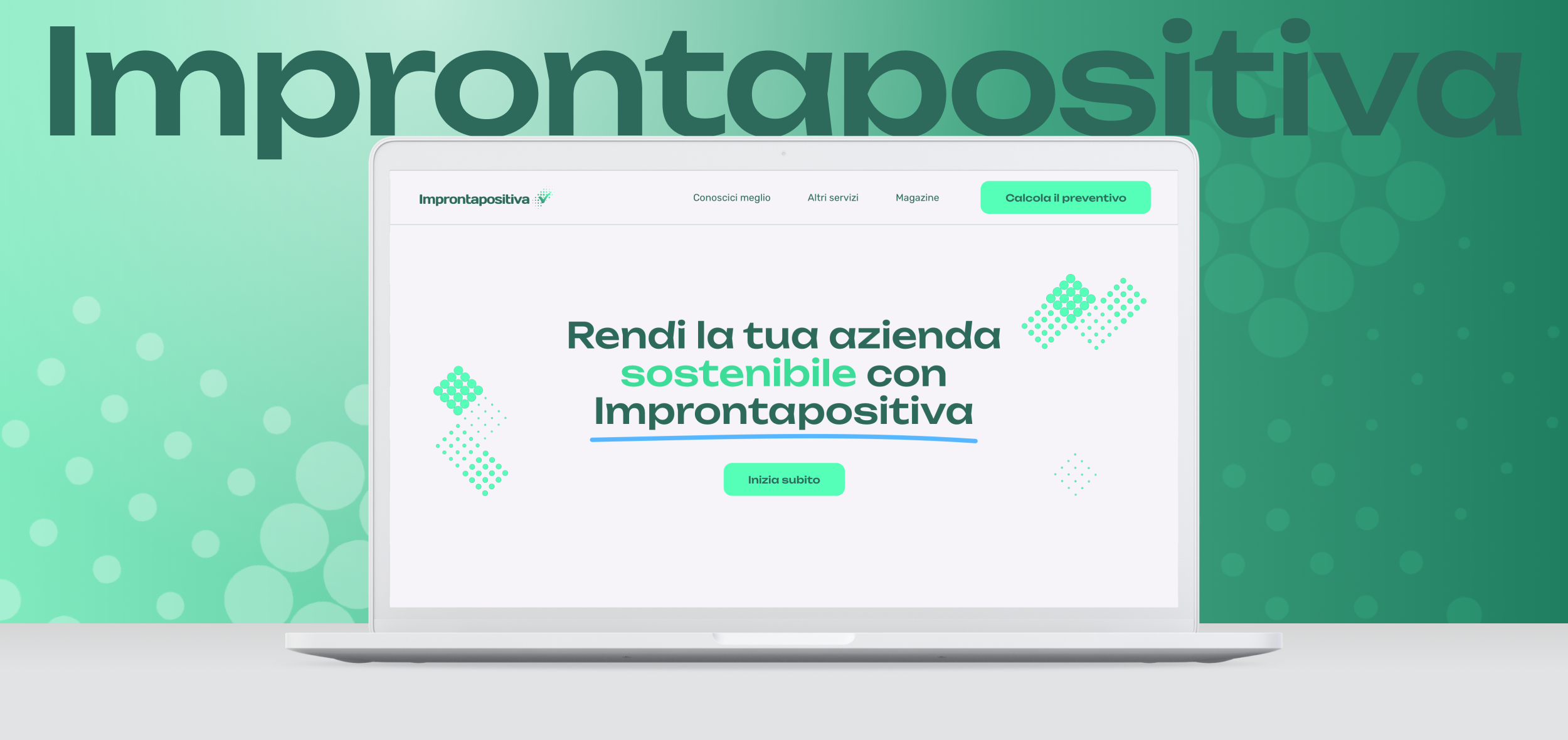
The website design aimed to reflect Improntapositiva’s commitment to sustainability and innovation through a clean, modern aesthetic and a color palette centered around fresh shades of green.
Made the sitemap, designed visuals, user experience.
THE CHALLENGE
-
The main challenge was to translate Improntapositiva’s values of sustainability and innovation into a digital experience that felt both modern and approachable. The website needed to convey trust and forward-thinking through its visual language, while remaining accessible and engaging, reinforcing the brand’s mission and making a strong, lasting impression.

MY ROLE
-
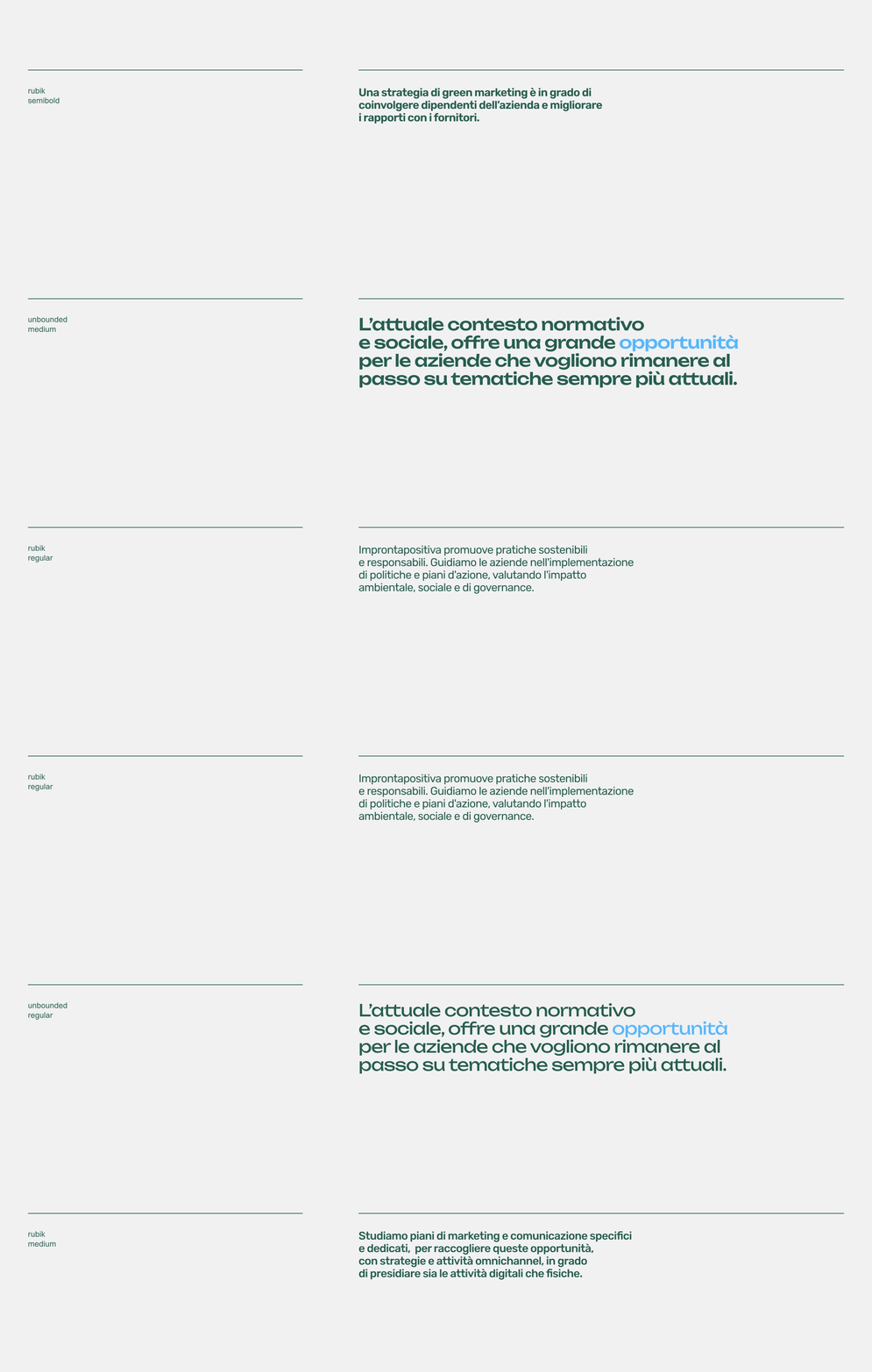
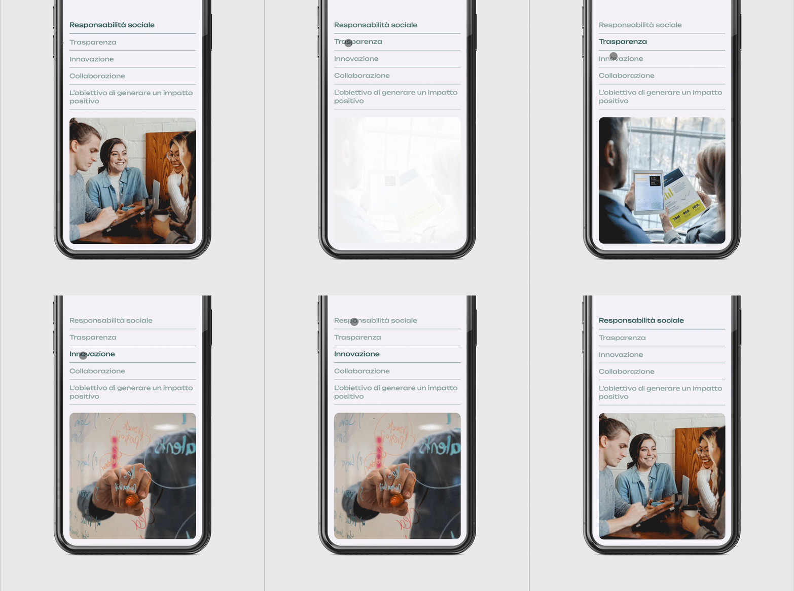
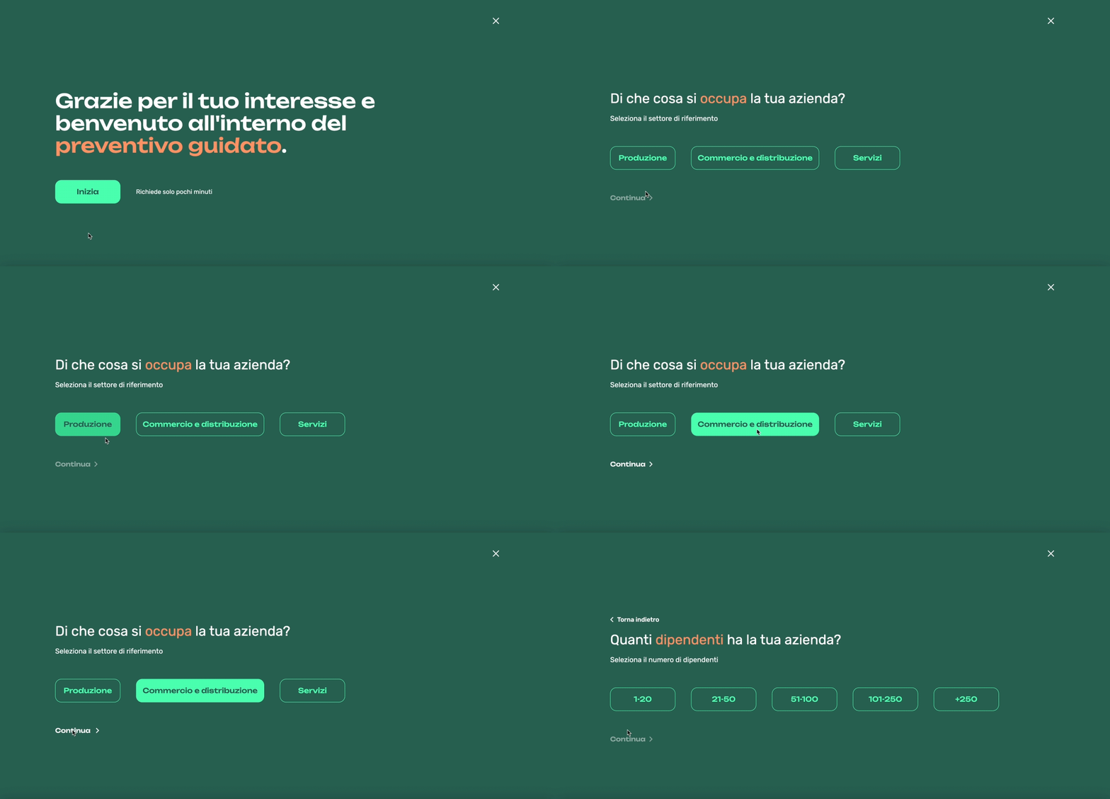
As the UI designer of the project, I developed the visual identity starting from the logo, which was made by a colleague, and expanded the colour palette, typography, and graphic elements. I adapted the provided content to fit the user interface and conceptualised the micro-interactions and animations.
THE PROPOSITION
-
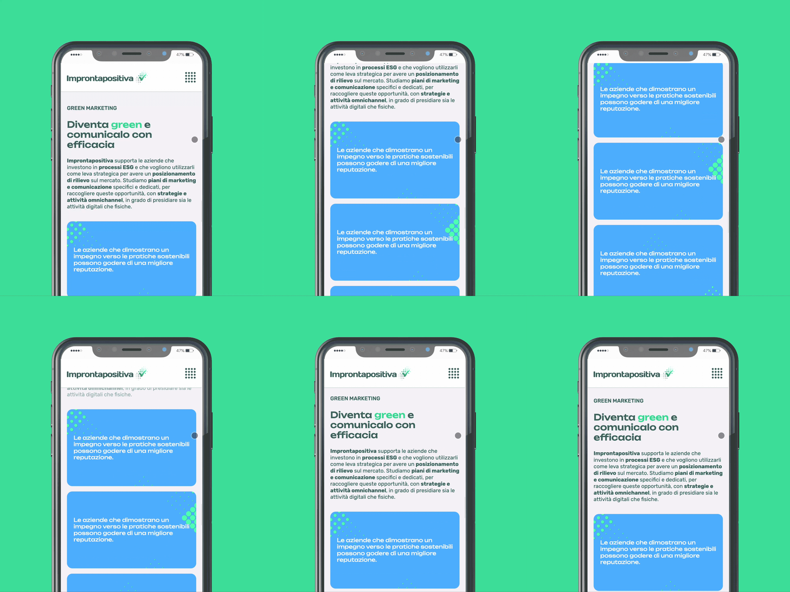
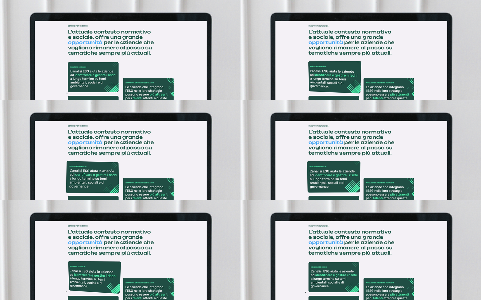
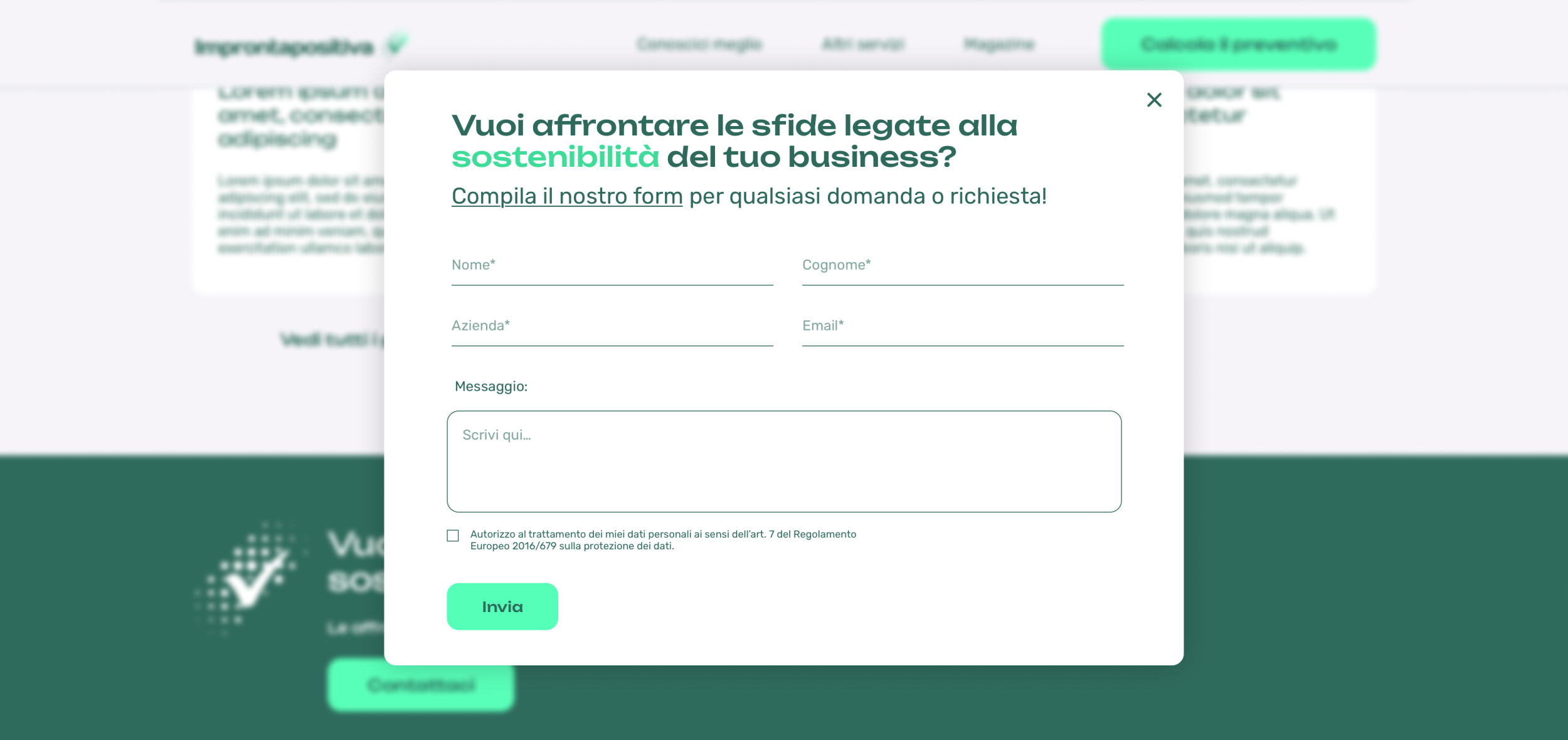
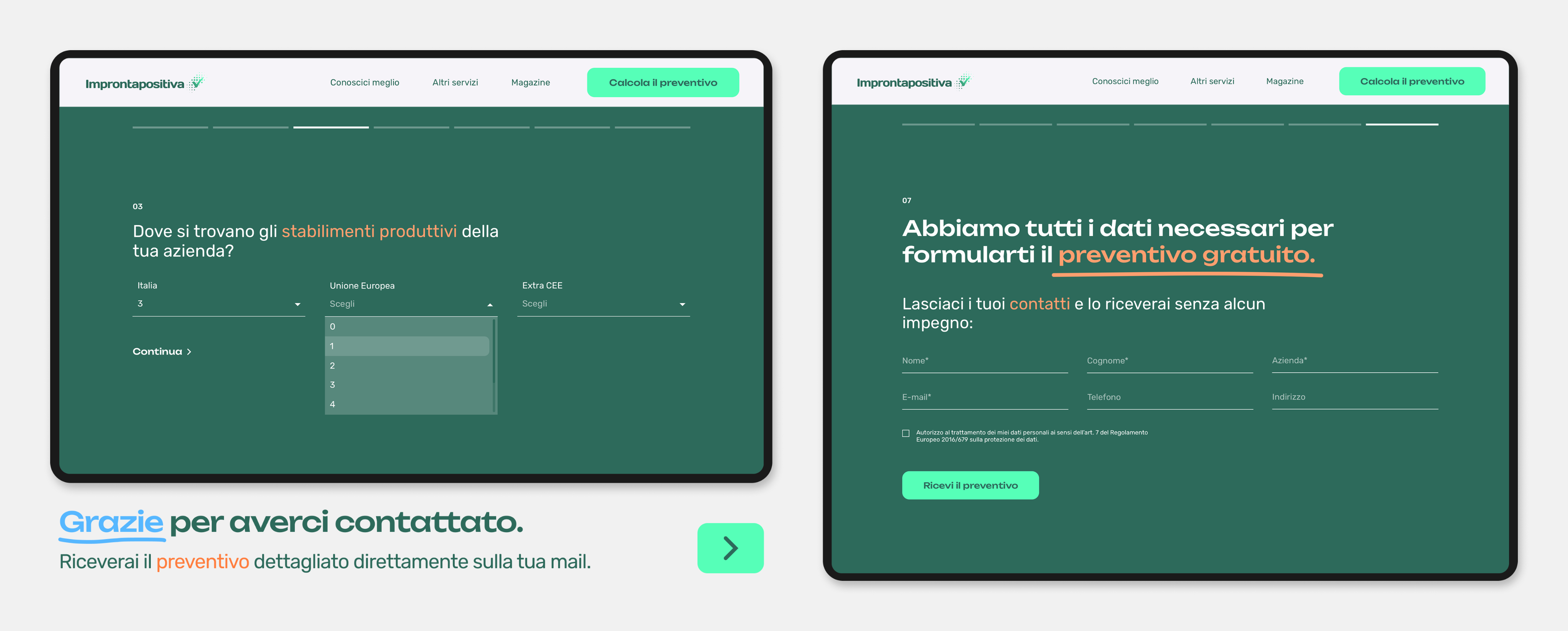
Capturing the tone the client wanted to convey was essential for this landing page. The content needed to be clear and easy to navigate, while subtly guiding users to request a quote, without making the call-to-action feel too pushy. I made sure the website worked smoothly on all devices, whether you’re on a laptop, tablet or phone. I used flexible layouts to keep everything clear and easy to use. The goal was to keep the experience consistent and intuitive, no matter the screen size.

UI DESIGN
-
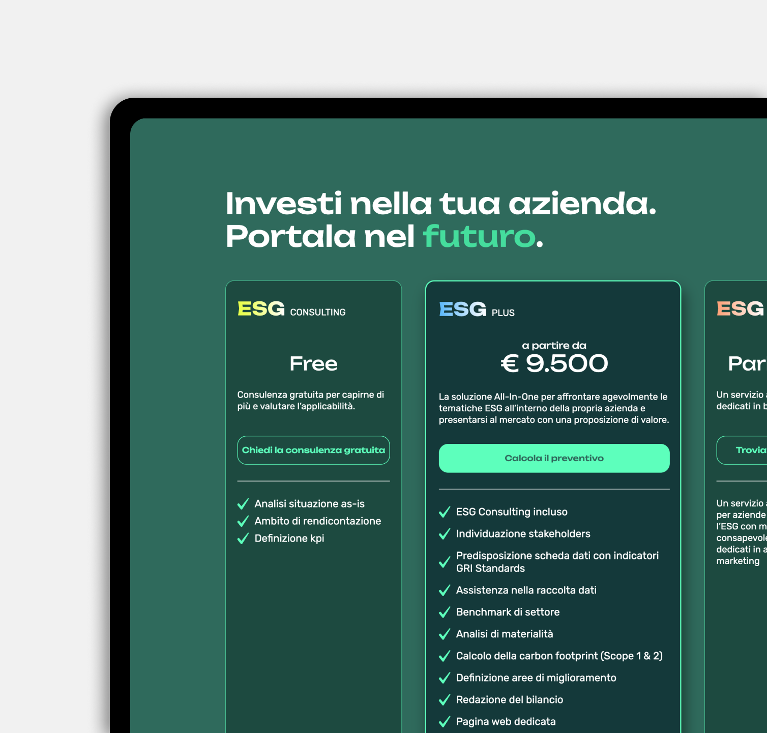
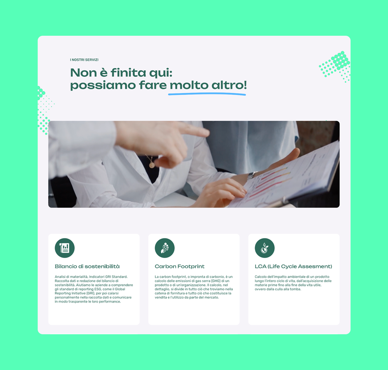
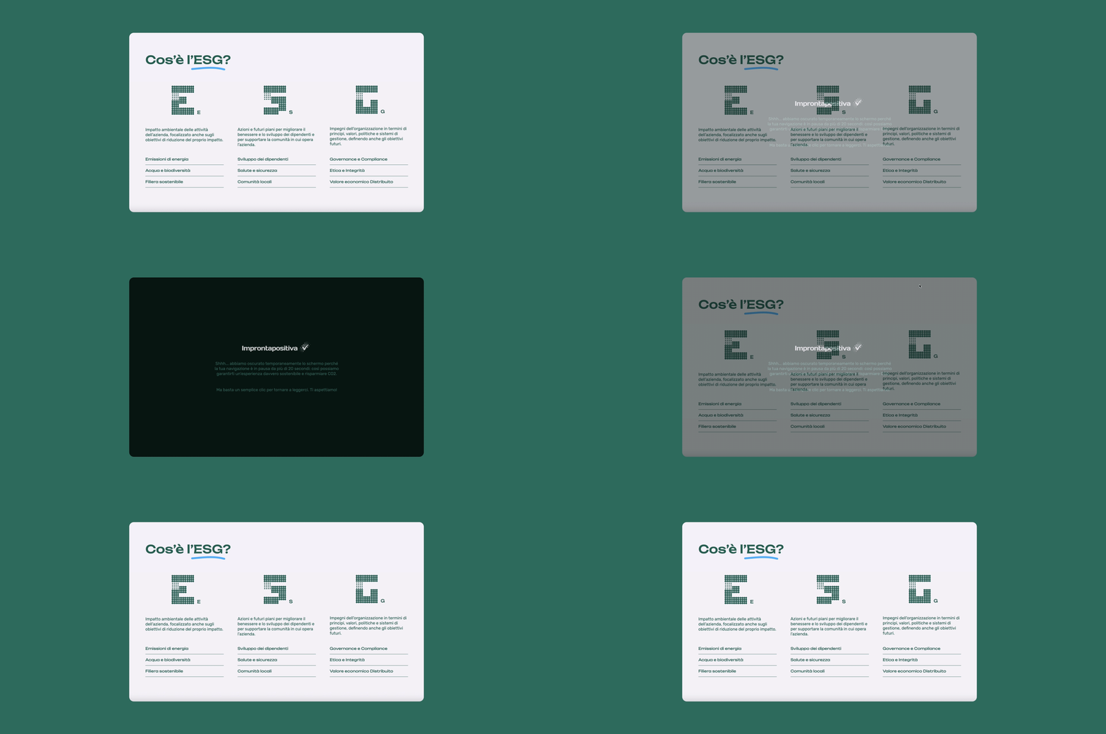
The UI design leveraged two contrasting shades of green, one deep and organic, the other bright and synthetic, to visually represent Improntapositiva’s dual identity: rooted in sustainability and driven by innovation. This intentional contrast highlighted the brand’s commitment to environmental responsibility while showing a bold, forward-thinking approach. A dotted pattern, inspired by elements in the logo, was integrated throughout the interface to add texture and make subtle references on technology and connectivity.

Other Projects
SEE PROJECT

SEE PROJECT
SEE PROJECT

Let me give you some info about me.
ABOUT

@

CONTACT
SOCIAL
Behance


@
Case Study
Improntapositiva
The website design aimed to reflect Improntapositiva’s commitment to sustainability and innovation through a clean, modern aesthetic and a color palette centered around fresh shades of green.
Made the sitemap, designed visuals, user experience.
THE CHALLENGE
-
The main challenge was to translate Improntapositiva’s values of sustainability and innovation into a digital experience that felt both modern and approachable. The website needed to convey trust and forward-thinking through its visual language, while remaining accessible and engaging, reinforcing the brand’s mission and making a strong, lasting impression.
MY ROLE
-
As the UI designer of the project, I developed the visual identity starting from the logo, which was made by a colleague, and expanded the colour palette, typography, and graphic elements. I adapted the provided content to fit the user interface and conceptualised the micro-interactions and animations.
THE PROPOSITION
-
Capturing the tone the client wanted to convey was essential for this landing page. The content needed to be clear and easy to navigate, while subtly guiding users to request a quote, without making the call-to-action feel too pushy. I made sure the website worked smoothly on all devices, whether you’re on a laptop, tablet or phone. I used flexible layouts to keep everything clear and easy to use. The goal was to keep the experience consistent and intuitive, no matter the screen size.
UI DESIGN
-
The UI design leveraged two contrasting shades of green, one deep and organic, the other bright and synthetic, to visually represent Improntapositiva’s dual identity: rooted in sustainability and driven by innovation. This intentional contrast highlighted the brand’s commitment to environmental responsibility while showing a bold, forward-thinking approach. A dotted pattern, inspired by elements in the logo, was integrated throughout the interface to add texture and make subtle references on technology and connectivity.

Other Projects
SEE PROJECT
SEE PROJECT
SEE PROJECT

Let me give you some info about me.
ABOUT

@
CONTACT
SOCIAL
Behance

@
Case Study
Improntapositiva
The website design aimed to reflect Improntapositiva’s commitment to sustainability and innovation through a clean, modern aesthetic and a color palette centered around fresh shades of green.
Made the sitemap, designed visuals, user experience.
THE CHALLENGE
-
The main challenge was to translate Improntapositiva’s values of sustainability and innovation into a digital experience that felt both modern and approachable. The website needed to convey trust and forward-thinking through its visual language, while remaining accessible and engaging, reinforcing the brand’s mission and making a strong, lasting impression.
MY ROLE
-
As the UI designer of the project, I developed the visual identity starting from the logo, which was made by a colleague, and expanded the colour palette, typography, and graphic elements. I adapted the provided content to fit the user interface and conceptualised the micro-interactions and animations.
THE PROPOSITION
-
Capturing the tone the client wanted to convey was essential for this landing page. The content needed to be clear and easy to navigate, while subtly guiding users to request a quote, without making the call-to-action feel too pushy. I made sure the website worked smoothly on all devices, whether you’re on a laptop, tablet or phone. I used flexible layouts to keep everything clear and easy to use. The goal was to keep the experience consistent and intuitive, no matter the screen size.
UI DESIGN
-
The UI design leveraged two contrasting shades of green, one deep and organic, the other bright and synthetic, to visually represent Improntapositiva’s dual identity: rooted in sustainability and driven by innovation. This intentional contrast highlighted the brand’s commitment to environmental responsibility while showing a bold, forward-thinking approach. A dotted pattern, inspired by elements in the logo, was integrated throughout the interface to add texture and make subtle references on technology and connectivity.

Other Projects
SEE PROJECT
SEE PROJECT
SEE PROJECT

Let me give you some info about me.
ABOUT

@
CONTACT
lspng@proton.me
SOCIAL
Behance
